Post your artwork (56k warning)

Speak your mind, or lack thereof. There may occasionally be on-topic discussions.
Post Reply
User avatar
Cuckooguy
LEGEND
Posts: 761
Joined: Thu May 27, 2004 12:27 am
Now Playing: Sonic Generations 3DS, Asura's Wrath
Location: Southern California
Contact:

Re: Post your artwork (56k warning)

Post by Cuckooguy »

Ugh, finally, I finally finished this MvsC2 thing.

Image

Yup, finally done and now I NEVER HAVE TO WORRY ABOUT IT AGAIN FOR THE REST OF MY LIFE yeah that feels good.

Image

The original intent for doing this thing in the first place was to try out different coloring techniques for every piece and to use more than one character in each composition since at the time I never drew characters interacting with eachother. Granted, there's not much character interaction going on but oh well I don't feel like fixing that.

By the way this is the 2000th post in this thread

User avatar
Brazillian Cara
Posts: 1729
Joined: Sat Aug 07, 2004 5:30 pm
Now Playing: the waiting game.
Location: On a never-ending quest to change my avatar.

Re: Post your artwork (56k warning)

Post by Brazillian Cara »

Well, those are two milestones that don't come together very often. Congratulations on both of them!

User avatar
Dash
Posts: 417
Joined: Sat May 29, 2004 2:01 am
Location: Somewhere between "here" and "there"
Contact:

Re: Post your artwork (56k warning)

Post by Dash »

So I've been working on my Sonic shark-jump pic. Wanted it here first because it's one of my first digital colorings and it'd be cool to get some input from people that know their way around the software before finally submitting(if help isn't against the rules I guess). Here's how it's looking...

Image

Learned a lot about working with Photoshop here. Namely, digital art program hates working with physical media. I thought I could forgo digital inking(no wacom= dull Paths tool marathon) and work with my hand inks but by the time I figured out that was a bad idea I had already gotten pretty far into it. On top of that I didn't really plan my layers out either... so yeah it's kinda iffy.

I'm not totally disappointed with it. The colors are mostly what I want them to be and there's a decent sense of depth. Still, it could use work. The biggest thing I can see is that the bricks could use some more blending and darker darks to give them more pop. Oh, and that awful spinning propeller effect. I was okay with it for a while but now I can't stand it. Gotta find a remedy for that. Pretty proud of the shark though.

So yeah, any advice would be much appreciated!

For those interested, I also have the smoother pencils and the choppy-but-chaming inks up for viewing. Maybe good for critiquing too.

User avatar
G.Silver
Drano Master
Posts: 2750
Joined: Sat May 22, 2004 12:58 am
Now Playing: Radiant Silvergun, Wario World
Location: warshington
Contact:

Re: Post your artwork (56k warning)

Post by G.Silver »

Probably you can find a tutorial on this somewhere for Photoshop, but sometimes it's hard to know what you're looking for when you don't know what the program is capable of. I use PaintShop Pro for my image-editing needs, but I know PS can do the exact same stuff too.

Image

So first you take your scanned image, I took the inked one, and I went into the Curves Editor. You can do the same thing by adjusting the contrast, but the Curve editor gives you complete control over the process, so if it's more than you want, then just go for contrast or some other filter. The objective is to make your white areas whiter and your black areas blacker, but you don't necessarily want the nasty jagged black lines that you get by decreasing the color count to 1 (ie, line art mode on your scanner), which is easy to work with, but it looks ugly. That link has more info, but basically, the curve represents light and dark, and will initially show you a 45 degree line, representing dark at the top and light at the bottom. You want to bend the curve to resemble a slanted "S" shape, so your dark grey values turn to black and your light greys turn to white. It doesn't have to be perfect, but you can see the result in the second image there, it's a lot cleaner.

Now if you're happy with the lines, you need to take that white space and make it transparent. There may be a better way to do this, but I use masks to create a transparent layer out of my inked drawing. I take the clean line art, and then copy it into a new image (so there's two images), and then cover the whole thing in solid black. Then I choose "create a new mask" and "create from image," and select the image I want to create the mask from, and the method "source luminance." I also have to have "invert mask data" checked. Your program and settings may be different, but that's the general idea, some tweaking may help. The result should be a "mask" of your lineart on one layer. If you look up close at this image and analyze the color of each pixel, you'll find that every pixel is solid black, but the transparency values are varied. Now you can create a new layer below that one, and the color will show through the transparent black, and you won't have those yucky white edges around anything. If you save the image I've made here, you'll find the transparency data is still there (it's a png) on the rightmost section, so you can see what you're trying to get to.

There may be easier ways, but that's my method.

User avatar
Esrever
Drano Master
Posts: 2981
Joined: Mon May 24, 2004 2:26 am
Contact:

Re: Post your artwork (56k warning)

Post by Esrever »

Personally, I DO just scan in 2-bit mode, only at a gigantic resolution. Generally speaking, scanning an image in 2-bit at 600 DPI or higher will allow you to reprint the image at its original physical size without any visible jaggies.

User avatar
gr4yJ4Y
Posts: 1366
Joined: Wed Jun 09, 2004 10:14 am
Now Playing: Breath of the Wild (Switch), Resident Evil VII (PS4)
Location: Crescent Knoll

Re: Post your artwork (56k warning)

Post by gr4yJ4Y »

I really like it except I think that Tails doesn't look quite right. It's like his colors are blending into the background or something. Or maybe it's his facial expression or body language (even though it's faithful to the source material). Otherwise, good job.

User avatar
Radrappy
Posts: 1329
Joined: Wed May 26, 2004 10:53 pm
Now Playing: MvC3, Vanquish, Skies of Arcadia Legends
Contact:

Re: Post your artwork (56k warning)

Post by Radrappy »

So guys.

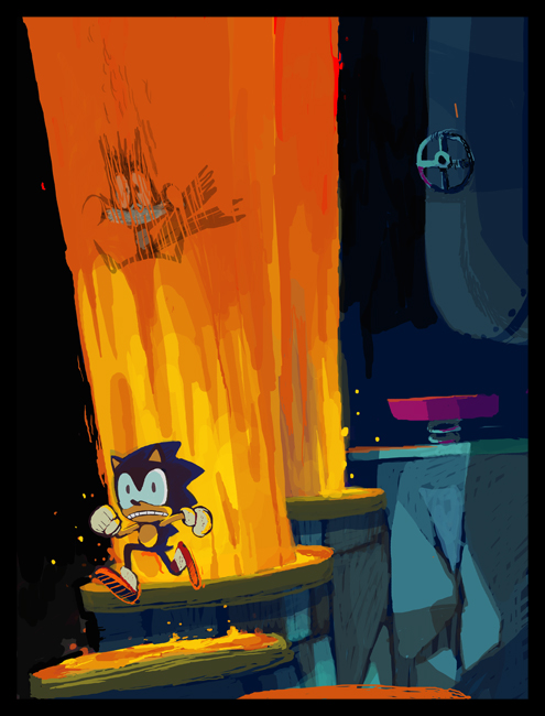
You draw sonic. you draw him, you draw him, and you draw him. Honestly, after drawing sonic for approximately 14 or so years of my life, it tends to get a little less exciting. So here I am, trying to come up with something for the first official sonic art contest in probably 10 years, and i got nothing. Well, almost nothing. The last thing I want to do is some epic, super sonic, final boss, schlock that basically would come down to me trying to be the flashiest(i.e. GHZ art contest 2007). So, with friday only a week away, I decided, hell I'll see what I can do. After putting around in photoshop for hours, I came up with this

Image

Now I'm pretty fond of the lava reef zone, especially act 2. And I thought it would be funny to throw tails in there seeing as he gets iced like, every couple seconds of gameplay. Heres where I'm open to suggestions. Is there anyway to make this thing, in your opinion, stronger before I commit to finishing it (polishing, adding badniks, background whatever)? Or, does anyone have an idea of a scene that they are just fucking DYING to see reproduced? If its cool enough, I'd be willing to try that for the next week instead.

User avatar
G.Silver
Drano Master
Posts: 2750
Joined: Sat May 22, 2004 12:58 am
Now Playing: Radiant Silvergun, Wario World
Location: warshington
Contact:

Re: Post your artwork (56k warning)

Post by G.Silver »

If there's a weakness in this, I think it's in the background, even with the obvious fire going on the location didn't immediately pop into mind for me--just because of the color and black backdrop, I was thinking Sky High or Scrambled Egg from Sonic 2 on Game Gear. Adding some more familiar background elements could take care of that, like some faded rock walls, or some of the closer background layers, or the Death Egg's crashed face peering into the underground. You'd probably need to enlarge the canvas a bit to one side or another to make room. It's freakin' rad as is, though!

I was limiting my image dimensions to plain 640x480, it sounded like that was a requirement in the contest guidelines? I've liked going more vertical lately!

User avatar
P.P.A.
Posts: 951
Joined: Fri Jan 18, 2008 5:36 am
Now Playing: Flying Princess - Inter Breed -
Mount & Blade: Warband
Location: Rhineland
Contact:

Re: Post your artwork (56k warning)

Post by P.P.A. »

I love it Radrappy. Though perhaps you should make some sides of the rocks orange as well, since they're being lit by the magma.

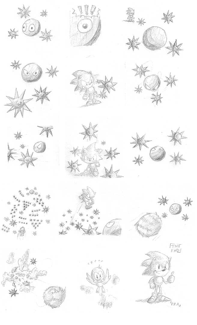
Also behold, a shoddy Orbinaut doodle I've been drawing for the last 3 days, usually from 00:00 to 02:00 at night while laying in bed.
Also notice the shading errors in the middle-right and bottom-left panels. Ugh.

Image

User avatar
Dash
Posts: 417
Joined: Sat May 29, 2004 2:01 am
Location: Somewhere between "here" and "there"
Contact:

Re: Post your artwork (56k warning)

Post by Dash »

I like it=) Maybe not technically perfect, but it has a lot of charm.

Thank you very much for the help G.Silv and Esrever! I'm going to give your methods a shot and try to start the coloring process over from there. That first one took hours as is, but that was mostly fighting the program and not choosing colors. Hopefully with my inks cleaner it ought to go a lot faster. If all else fails I'll make a couple tweaks and enter the first one but we'll see.

And I hear you on the Tails thing J4Y. Color trouble is there's a lot of orange going on already so he needs some more darks to stand out. As far as the pose goes, I know it's odd but I love it. I always thought it was hilarious how once they jumped on those things they seemingly got locked into a stiff zombified state. That's the joke I was going for, not sure if it reads clear though.

And Rappy, that pic is killer. Lava Reef is one of my top favorite zones.

User avatar
Neo
Posts: 974
Joined: Mon Jun 19, 2006 6:18 pm
Location: Portugal

Re: Post your artwork (56k warning)

Post by Neo »

Radrappy: Lava Reef's walls and floors are made of smaller rocks, about Sonic's size. They're also considerably brighter, but the fact that you just have large slabs instead of small pebbles is mainly what's keeping the zone from identifying itself.

User avatar
Radrappy
Posts: 1329
Joined: Wed May 26, 2004 10:53 pm
Now Playing: MvC3, Vanquish, Skies of Arcadia Legends
Contact:

Re: Post your artwork (56k warning)

Post by Radrappy »

Thanks for the advice guys, all of it was helpful. I can't wait to see the other entries! If we've all picked kind of random sonic moments, we'll truly have a nice collage on our hands when this is over. Maybe GG can make use of the art with the museum or something.

Gsilv, about the composition size,

From http://www.sega.com/sonicblackknight/contest/us/
YOUR MASTERPIECE: All the work submitted must be original and created by you. Art can be hand drawn or created digitally. Please keep the dimensions of your art to 11 inches x 8.5 inches. For hand drawn submissions color drawings on plain paper are best.
P.P.A. wrote:I love it Radrappy. Though perhaps you should make some sides of the rocks orange as well, since they're being lit by the magma.


Yeah, I know what you mean but I really wanted to keep the blue strong. The appeal of this zone/act to me is the contrast of blue landscape with orange lava. It's a really gorgeous combination that would probably be lost if I encroached on the blues any further. I may line the top with orange lit pipes though.

User avatar
P.P.A.
Posts: 951
Joined: Fri Jan 18, 2008 5:36 am
Now Playing: Flying Princess - Inter Breed -
Mount & Blade: Warband
Location: Rhineland
Contact:

Re: Post your artwork (56k warning)

Post by P.P.A. »

Radrappy wrote: Yeah, I know what you mean but I really wanted to keep the blue strong. The appeal of this zone/act to me is the contrast of blue landscape with orange lava. It's a really gorgeous combination that would probably be lost if I encroached on the blues any further. I may line the top with orange lit pipes though.
Heh, I never noticed that in Lava Reef as much as in Flame Core (S06). Most beautiful stage in the game, because it has that exact contrast of red glowing magma and dark blue/grey rocks and sky. Except even stronger than LRZ does.

User avatar
G.Silver
Drano Master
Posts: 2750
Joined: Sat May 22, 2004 12:58 am
Now Playing: Radiant Silvergun, Wario World
Location: warshington
Contact:

Re: Post your artwork (56k warning)

Post by G.Silver »

I missed that on the front! But here in the terms and conditions it says:
(d) if you are submitting your Fan Art electronically it must in either .jpg or .png file format no larger than 1 MB and cannot exceed an electronic display of 640 (W) x 480 (H) pixels

User avatar
Radrappy
Posts: 1329
Joined: Wed May 26, 2004 10:53 pm
Now Playing: MvC3, Vanquish, Skies of Arcadia Legends
Contact:

Re: Post your artwork (56k warning)

Post by Radrappy »

G.Silver wrote:I missed that on the front! But here in the terms and conditions it says:
(d) if you are submitting your Fan Art electronically it must in either .jpg or .png file format no larger than 1 MB and cannot exceed an electronic display of 640 (W) x 480 (H) pixels
Crap I guess you're right. Wow that's insanely stupid that they'd arbitrarily allow pieces that are 480(H) X 640(W) but not ones that are 480(W) X 640(H). I guess I could try to work long ways, but its just not what I had in mind. What is the point of that restriction? Honestly, they probably only mean to say that a piece can't be larger than 480 X 640pixels in general. I mean, they didn't demand that all hand drawn pieces be on paper that's 8.5(H) X 11(W).

User avatar
G.Silver
Drano Master
Posts: 2750
Joined: Sat May 22, 2004 12:58 am
Now Playing: Radiant Silvergun, Wario World
Location: warshington
Contact:

Re: Post your artwork (56k warning)

Post by G.Silver »

Yeah, it's weird! One basically contradicts the other. I imagine it has to do with the way the winning entries will be displayed in the finished game. They wouldn't want to have some images require scrolling, that would mean more work for them!

User avatar
DackAttac
Posts: 886
Joined: Thu Dec 01, 2005 7:37 am
Location: Albany, NY / Boston, MA
Contact:

Re: Post your artwork (56k warning)

Post by DackAttac »

Or, you know, resize it their goddamn selves.

User avatar
G.Silver
Drano Master
Posts: 2750
Joined: Sat May 22, 2004 12:58 am
Now Playing: Radiant Silvergun, Wario World
Location: warshington
Contact:

Re: Post your artwork (56k warning)

Post by G.Silver »

So, I'm going with the end of Sonic 1, because it's a scene, and it finishes out my "set." I was giving real thought to a shark-jumping entry but damn Rad Rappy and his "serious" entry made me change my mind. >:(

Image

Things were going great I think with the lineart and I was playing artsy with it and turning it on its side and shit and then I thought hey, what if it were vertical after all?

Image

It's a mess but I can fix it. Do we think vertical entries are ok for the contest after all, and which one is better?

User avatar
P.P.A.
Posts: 951
Joined: Fri Jan 18, 2008 5:36 am
Now Playing: Flying Princess - Inter Breed -
Mount & Blade: Warband
Location: Rhineland
Contact:

Re: Post your artwork (56k warning)

Post by P.P.A. »

The top one definitely. It's absolutely stunning.

User avatar
Yami CJMErl
Posts: 1271
Joined: Tue Jan 16, 2007 2:03 pm
Location: Western New York
Contact:

Re: Post your artwork (56k warning)

Post by Yami CJMErl »

I like the horizontal one better, myself.

User avatar
Xyton
Posts: 222
Joined: Fri May 05, 2006 9:53 am
Contact:

Re: Post your artwork (56k warning)

Post by Xyton »

I like the horizontal one, too.

User avatar
DackAttac
Posts: 886
Joined: Thu Dec 01, 2005 7:37 am
Location: Albany, NY / Boston, MA
Contact:

Re: Post your artwork (56k warning)

Post by DackAttac »

I personally think the vertical one better captures Sonic's hard-fought emergence out of the Labyrinth redux and makes Eggman look more intimidating by giving him a higher elevation than Sonic.

User avatar
RocketPunch
Posts: 104
Joined: Mon Jan 07, 2008 1:41 pm
Location: USA
Contact:

Re: Post your artwork (56k warning)

Post by RocketPunch »

I like the top one. All of the badnik's, Eggman, and his machine sort of form a circle around Sonic, making him and his actions the clear focus of the pic. The vertical one doesn't have that going for it and looks sort of disjointed and cluttered.

User avatar
G.Silver
Drano Master
Posts: 2750
Joined: Sat May 22, 2004 12:58 am
Now Playing: Radiant Silvergun, Wario World
Location: warshington
Contact:

Re: Post your artwork (56k warning)

Post by G.Silver »

Yeah, general consensus seems to be on the horizontal, though I do really like the vertical layout for the reasons Dack mentioned. I'll probably stick with horizontal.

Also, a moderator on Sega's official forum assures me that Sega doesn't care about which layout we submit, if anyone was concerned.

User avatar
Radrappy
Posts: 1329
Joined: Wed May 26, 2004 10:53 pm
Now Playing: MvC3, Vanquish, Skies of Arcadia Legends
Contact:

Re: Post your artwork (56k warning)

Post by Radrappy »

I appreciate you finding out. I'll keep mine vertical then.

I also think the horizontal one is a better fit. Looks great.

Post Reply