GHZ Art Contest - Best Art


Adamis - Did a great job. I like the idea and it's well done, but you're overshadowed by some other entries.
BlazeHedgehog - I'm surprised no one has voted for this one yet. It was one of the top four in my opinion. The blur of the propeller and glow of Super Sonic and the stars in the backround is really nice. I think it would have been of a bit stronger composition if all of Death Egg wasn't in view (e.g. Sonic's hand covering up an edge of it).
cjmcray - The lack of color makes this one few inferior to the rest. The idea of Sonic coming out of the picture is good though.
dashfox1 - There's something a little off about all the character models and the view doesn't seem to line up right with the backround.
DBurraki - This was my third favorite entry. It's really professional. I'm not sure I like the way the top is layed out though.
Esrever - I like how Sonic is glowing and has a sense of speed. This is lost though in the way Metal Sonic is loomed over. But good sense of focus on Sonic with everything else dark.
G.Silver - I'm not sure I'll every get used to the idea of Sonic riding a vehicle of any kind.... I like the semi-fisheye view.
JamieLee - I could have mistaken this for official artwork! It fails at standing out amongst all of these more unique, yet unheard views of Sonic & co.
Kelso - There's something not right about Sonic in all of his positions...
Opa-Opa - I like the serenity and pre-modernism. It's very unique to take such a modern character as Sonic and put the level in a pre-modern world.
Senbei - Green Hill Zone with the monkeys in the trees didn't settle well in my stomache. I'm not sure if I'm a fan of the comic style layout for this kind of contest. Everything is done really well otherwise.
Radrappy - I really like this one. It's the one I voted for. I think having Sonic and Knuckles back-to-back facing their enemies is great. And the thick paint feeling is unique. The Doomsday side is my desktop backround.


Freiza, do I really need to prove I can draw super metal sonic? I thought the implication of him(as sonic is in Opa's piece) was a lot more charming then a tacky little bit of him in the center of the comet. (I experimented with this though.)
Unless you mean it loses points for being unclear. Which in case I can only let that be up to your discretion seeing as I happened to like its ambiguity
And to Crazy Penguin regarding composition: You've called my bluff in the sense that I did not draw the first picture with two in mind at all. It only became an idea at the last minute to do another of the actual doomsday zone.
Regardless, this is fun discussion and for some reason very exciting. With an entire week to go and a total of over 400 registered members, this party is just getting started.
-
Frieza2000

- Posts: 1338
- Joined: Sun Jan 23, 2005 9:09 am
- Location: confirmed. Sending supplies.


Wait, that's what's going on? I thought it was meant to be Knuckles watching the Super Sonic/Eggman scrap, which was big and dramatic enough to be seen from Angel Island.Frieza2000 wrote:I don't particularly like Rappy's...according to his post that golden comet is supposed to be Super Metal Sonic
Man, that makes me like it quite a lot less! Glad I didn't vote for it now, heh.
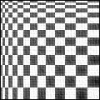
I rushed a bit, I know (my entry was late, naughty naughty). The checkered patterns are in my deviantart, but that's not in the contest. I'm sad it couldn't make it here, but I'm glad at least something has.Crazy Penguin wrote:where are the robots, the animals, the point markers, the rings, the item boxes, the checkered patterns? Too many shortcuts.
In my defense, I guess the path I depicted is very accurate.
It was drawn intended to be super metal sonic, yes. The idea was that I wanted to show both of their final bosses, making beating the game more of a group effort of sorts. This may sound half assed but if you want to view it a certain way that makes it more enjoyable to you then do it. Part of me NOT drawing metal sonic was leaving it ambiguous. What ever though. I'm not going to defend this anymore.

Well, I put the watermark so people wouldn't steal it thinking it actually was official art (I don't normally do watermarks), and no the pose isn't actually copied. The only thing I might have copied from official artwork was the positioning of Amy's quills and some help on her hands, everything else is 100% my own doing. It was SUPPOSED to have a background of Palmtree Panic that included Sonic in it, but... I didn't have time to finish it =/ Aw well.Frieza2000 wrote:Jamie Lee's is great quality, but there's an ugly water mark in Amy's eye, no background, and I believe the position of the characters is taken straight from official art.
Last edited by Jamie Lee on Sun Mar 04, 2007 3:30 pm, edited 1 time in total.
Glad to see mine's well liked. The background is probably the worst part of the whole thing, though, but not from want of trying. I was panicking on the 2nd trying to figure out a way I could do a background that was interesting- because really, I was only focusing on the group part of the picture. There was actually a prototype of the picture I showed around, the background was a lot plainer (and frankly fugly). Only had Eggman/Robotnik's silhouette and some really, really crappy stars. It actually managed to suck the good out of the entire picture, so I went back to improve- mostly the stars and filling up blank space with Metal and the Death Egg. It really picked it up, I think.
Metal's arm looks a bit awkward there though because part of Eggman's 'stach overlaps with it, so, blegh. Metal also covers up my favorite nebula of stars as well...
Metal's arm looks a bit awkward there though because part of Eggman's 'stach overlaps with it, so, blegh. Metal also covers up my favorite nebula of stars as well...
-
THEbigLANDMAN

- Posts: 129
- Joined: Wed May 26, 2004 4:50 am
- Location: Catalonia
Something I really aimed for in my Sonic drawings was what I call "lunchbox potential." I wasn't necessarily aiming to be the best, technically, but I wanted to at least capture the "feel" right, in a way that most "unoffical" Sonic art tended not to be. I wanted to draw the kinds of things that would appear on a lunchbox or some other shitty piece of paraphenalia, but something that looked good and indicated that the artist really understood what he was doing, and wasn't just doing it mechanically, knowing people would buy it because it had Sonic's face on it. So, when I say something like "would look great on a lunchbox," I consider that to be high praise.
Adamis -- I like the pose of Sonic on this one, but Eggman's robot is not especially intimdating-looking, both in the pose and proportions, I think he ought to be scarier. :) The background is also a little bland--drawing that much metal (especially for the floor) would have been a daunting task so I don't blame you for taking the short cut, but the yellow "caution" floor looks a little too cheap in my opinion.
Blaze -- Great work on the plane! I especuially liked the bit in the video you made where you zap from each little metal bolt on the engine, highlighting one right after another. I'm a little bothered by the way Sonic and Tails are facing different directions, as a "scene" it's a little confusing, there's no feeling interaction between the two (I suppose that's kind of what it's like playing with SuperSonic and Tails anyway). The Death Egg's exploding is not very interesting here, I think it either should have been pushed more into the background and made more subtle, or made more brilliant and overstated.
CJM -- The B&W does hurt this one, since color ended up in everyone else's compositions (even Esrever's!). The layout is a little too packed for the black and white, it doesn't "read" as cleanly as it would in color, and it's hard for me to say if the frame is a plus or a minus. I like seeing a group of characters all together, but seeing SA-style Eggman in a tiny (a little too tiny) 16-bit Eggmobile conjures up images of Sonic Advance, which is a negative point right there. :)
Dash -- In spite of some rough areas on this one, like the changing perspective from Tails and Knuckles to Eggman and Amy, the oversized flower, Eggman's pose doesn't seem quite right.. This one is just really pleasant to look at, and I think it's all in the color. The low-detail background really works, Sonic and Metal look really good, and the other characters help to keep the background from looking too bland. This is a really good composition. Kudos for the bold lines too, I wish mine had been bolder! I would buy a lunchbox that had this on it.
DBurraki -- The pros of this one are obvious. :) The top half is definitly the weaker area, Metal Sonic's silhouette feels a too stiff and rigid to me, even as a robot, and the Death Egg looks rather unimpressive. I love the Eggman silhouette though, so it seems like a great idea, but just needs to crank up the ominous up there just a bit more to really complete it. It seems odd that in a group shot that Sonic isn't looking at the viewer, all the other characters have so much personality going (Amy's hilarious), the main character looks a little vapid. I really like the way you've colored the "whites" of the eyes, too.
Esrever -- I think Sam looks a lot less like Sonic now that I see you drawing him again. This one's really neat and bold, and a good use of what I assume is a photo background (is it taken from Speed Highway?) Metal Sonic's hangy position is not the sort of thing we see him in usually, it looks sort of "weak," but gives a Tails Doll kind of creepy that makes him quite ominous, clashing nicely with Sonic's "don't give a damn" expression. I wasn't sure if the light behind Metal was the moon or his exhaust, which also adds to the creepy but isn't really a plus either. The drawn background is really simple but totally works for some reason that I can't put my finger on. I would buy a lunchbox that had this on it.
Frieza -- Eggman Nigga, lol! The blooper is also good.
G.SIlver -- The idea here was that Sonic is such an asshole that he would grab an innocent-looking badnik and ride him to victory. Looking back at my original rough pencils, the mountains actually curved more, the idea was that they were ramp-like looping structures that enclosed the environment, but as I set in on them I seem to have forgotton that and just made them straight as in the game, and who knows if they'd have worked like that anyway. I was a little worried that this wasn't going to come out at all, and I do wish the lines were bolder to balance out the color a little better. The badnik Amy is riding was unexpectedly hard to draw, especially when I changed the angle, I'm still not happy with it and I probably shaded it all wrong. I'm really pleased with Eggman though, his hover-scooter in Sonic CD is one of the coolest vehicles he's made, I think (though I still didn't entirely nail that, either).
Jamie Lee -- The technical work on this one is good, though the edges look a little too soft to really compare with the corresponding Sonic + Amy official art. Metal Sonic's pose is also a little confusing, we're assuming he's flying (Amy looks it) but it also looks like he's just standing on the ground, looking up at the sky. :)
Kelso -- There was a time when I used to draw stuff like this, Sonic all over one scene in different poses or angles, but eventually I grew out of it, so now when I see it it reminds me of the things I drew on notebook paper in middle school. (Better executed by far, though.) Some good poses though, and the grass texture is nice--I can't tell if you drew it or borrowed it, but it works. The kicked-up dirt doesn't really mesh with it, though.
Opa-Opa -- I think my favorite thing about this one is the opposite of Kelso's, I almost expected tiny Sonics to be crawling all over this landscape, but instead he's just in the one spot. I like that so much of the GHZ act 1 is plainly visible for those who recognize it, but I'm not really digging on the softer definition of everything (it's clearly working for others, though), I'd like it to be a bit more geometric, like the loop is.
Rappy -- the thing about Rappy is that his poses and painting technique are just plain awesome. I voted for him because I like his technical skills and wish I had them. CP had a great comment that as a diptych painting the two sides don't really compliment eachother, and I also agree that seeing Mecha Sonic would have been cool (would probably have been a completely different image though), but I like them both so much as they are. Also, I always thought the Doomsday Zone boss rocket looked kind of stupid, but here it looks extremely cool, imbued with unexpected power and elegance. Would definitly put on a lunchbox.
Senbei -- This is definitly my number 2. The poses are great (and so simple!), and the sense of motion is fantastic. The color is a bit muddy but the effect that it has on me is oddly nostalgic, it somehow reminds me of an old comic that may or may not have existed, with a limited color count or something. I don't know if I'd put it on a lunchbox, but it's still excellent.
theEyZ -- As a gag, this is alright, but cracking on Mighty and/or Ray just seems done to death by now. I liked Mighty in particular, but I guess I know what this joke is about too much to actually think it's funny? Anyway, a good shocked look on Mighty's face and Shadow is done nicely, but doesn't really fit with the rest of the entries.
Wooduck -- I have to give some credit for going with traditional media, but for such a dark scene I'm not sure if it doesn't detract a bit. Like EyZ' entry, I'm not wild about this as a "political comic," though I certainly appreciate the sentiment, and it totally does remind me of the boss from Streets of Rage (You became the boss! YOU ARE GREAT!), though I imagine that probably says something about the cultural void in my mind than anything deliberate? There is probably some brilliant movie I'm supposed to be thinking of. Also, is Sonic both behind the desk, and on the floor at the bottom of the panel? What is that down there?
GG! didn't enter the contest because I think he hates it when people see his drawings, so I'm going try to embarrass him by drawing everyone's attention to the front page--I almost never see it because I just have the forum bookmarked, but holy shit, that GaniGani is awesome. He is full of both volume and terror, you can practically see (and hear!) his little clacky legs scrambling in fright. I don't think any entry in the contest really captured that same sense of motion.
Last edited by G.Silver on Sun Mar 04, 2007 4:10 pm, edited 1 time in total.
-
Light Speed

- Sexified
- Posts: 2529
- Joined: Sun May 23, 2004 4:08 pm
- Location: Park City, Utah
- Contact:

The original picture was going to be a little bigger, and the Sonic the Hedgehog symbol was going to be on the floor, unfortunately when i cropped the picture I did not realize that it would look so odd, and did not see it in such an odd light until just now. As for traditional I had just spent a good amount of cash on prisma's and want to start using them, on top of that I have no tablet, therefore to do the look I wanted I had to try with pencil. the streets of rage thing was totally coincidental, though I'm glad that it reminded people of that, and no movie reference.
I chose a cartoonish thing because my skill with pencils is not yet great enough to compete with those who have tablets at their disposal, i thought that if I tried an action scene or landscape thing that it would get overshadowed by someone with better equipment. I figured I would need something other than just appearance if I wanted any chance at placing.
And that crab would have won it all, that is going onto my desktop now
Last edited by Wooduck51 on Sun Mar 04, 2007 6:18 pm, edited 2 times in total.
-
Crazy Penguin
- Drano Master
- Posts: 1903
- Joined: Sat May 22, 2004 10:06 pm
Actually, I didn't really have the GHZ in mind when I drew it. Sure there are checkered patterns, but that's just a staple. It's more like Generic Hill Zone than anything.gr4yJ4Y wrote:Senbei - Green Hill Zone with the monkeys in the trees didn't settle well in my stomache.
I noticed the gani-gani on the front page during the contest and it got me excited about Gibbon's potential entry, but I didn't really expect him to submit anything. Anyway, the crab's badass; I especially like the sense of foreboding that the lighting gives.
-
BlazeHedgehog

- Posts: 671
- Joined: Thu May 27, 2004 9:11 am
- Location: Colorado
- Contact:
Yeah, it's worth mentioning that Tails, the Tornado, and Super Sonic were all drawn as three separate pictures. I've gotten kind of lazy and I play it safe by drawing "complicated" pictures in separate pieces.
I knew Super Sonic wasn't facing the right way, but I liked the way he turned out individually and didn't want to redraw him (plus, time was not on my side - which is my own fault, mind you, but still).
I had originally pictured the Death Egg being much bigger in my mind, but I worried it might overshadow Sonic and Tails, so I scaled it way back.
It's my WWW button. But here it is: http://upaupa.deviantart.comLight Speed wrote:Hey Opa, whats the link to your deviant art page? I want to see the finished version.
Wow. 69 total votes.