Page 6 of 6
Posted: Sat Mar 03, 2007 12:09 pm
by Senbei
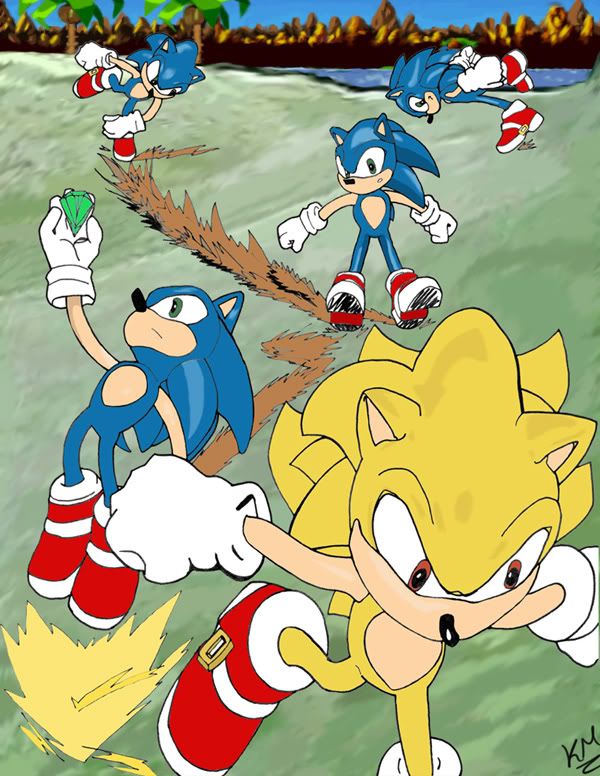
Entry for best art.

Didn't turn out as well as I'd have liked; I'm still getting used to using colors. But it was a lot of fun to make. Hope you guys like it.
Oh, and to avoid confusion, the last three panels are meant to be read right to left. Switching reading direction isn't something you often get the chance to do with comics, so I took a liberty here. Of course, you can also consider the picture to be a random collage of images, rather than a traditional comic, as the panels don't really have much to do with each other.
Posted: Sat Mar 03, 2007 1:13 pm
by Owen Axel
Colouring all the dust clouds brown sure makes Green Hill look downright muddy, but regardless, that's a really nifty sequence you've drawn. I like it a lot.
Posted: Sat Mar 03, 2007 2:58 pm
by Radrappy
The sense of action and attitude is miles above anything you'd ever see in an archie comic. The rough marker style harkens back to sonic's design phases and really serves the motion. Jesus dude. Hone this ability and produce some memorable sonic comics that are true to form.
Posted: Sat Mar 03, 2007 3:09 pm
by Senbei
I've always believed Sonic works better in a comic format rather than singular pictures, because multiple panels better convey a sensation of action and speed. The problem with Archie is that they let (mediocre) story get in the way of the action. Issue #98 -- the SA2 adaptation that cover artist Spaz pencilled -- is probably my favorite issue because it simply featured Sonic running through City Escape in the same manner that I tried to capture in this work.
Posted: Sat Mar 03, 2007 3:21 pm
by Locit
Owen Axel wrote:Colouring all the dust clouds brown sure makes Green Hill look downright muddy, but regardless, that's a really nifty sequence you've drawn. I like it a lot.
It actually seems to be a mix of the Green Hill and Emerald Hill Zones based on the presence of flowers, rocks and Gani-gani from the former and Ai-ai's and Stingers from the latter. Strange, but wonderful!
Posted: Sat Mar 03, 2007 6:12 pm
by Adamis
My entry. Click on the picture to see the full-sized version.

And in case you can't see it on my ftp, here's the
Deviantart version.
Posted: Sat Mar 03, 2007 7:20 pm
by Opa-Opa
Not much time left...
EDIT: Actually, there's much more I thought there was. Thank you timezones!
Posted: Sat Mar 03, 2007 7:27 pm
by Locit
My entry for worst. I gave myself 60 seconds and two colors.
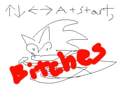
The "bitches" is a little too legible for my liking, but there you have it.
Posted: Sat Mar 03, 2007 7:30 pm
by Segaholic2
4.5 hours left. GET YOUR ENTRIES IN
Posted: Sat Mar 03, 2007 8:10 pm
by Opa-Opa
Worst art:

That's my fan character Rico the Hedgehog. He's Sonic's long lost brother that was roboticized but was brought back by Antoine. He's got all the characters abilities because of the robotization.
Posted: Sat Mar 03, 2007 8:20 pm
by Opa-Opa
Senbei wrote:Oh, and to avoid confusion, the last three panels are meant to be read right to left.
Actually, the ending is quite beautiful with him jumping away over the spikes and grabbing the rings.
Posted: Sat Mar 03, 2007 10:02 pm
by Jamie Lee
For best art catagory
<img src="
http://www.shatteredmoonlight.com/image ... apping.jpg">
This isn't finished but I'm submitting it anyway o@ I was GOING to put a background behind this and have Sonic also in the picture, but... time restraints. Mugh.
Man my hand hurts like a mofo trying to book this thing. Shows too x_x It's sloppy as all get out. Oh well...
Posted: Sat Mar 03, 2007 10:07 pm
by Brazillian Cara
Well, it's not bad- almost looks like an official art, but Metal Sonic's legs are too stiff.
Anyway, you can always post the finished version in the other thread.
Posted: Sat Mar 03, 2007 10:34 pm
by BlazeHedgehog
*sweat*
Hoo. Didn't think I was gonna make it. I still have 30 minutes, right? I'm no good with timezones. Best art catagory:

I actually did a timelapse of me inking and coloring this, and I will be posting that on Youtube shortly, for those who might be amused by such a thing.
It didn't turn out quite as I expected, but that's okay. I am more or less comfortable with it, I think.
Posted: Sat Mar 03, 2007 10:53 pm
by Kogen
Posted: Sat Mar 03, 2007 11:31 pm
by cjmcray
Nice one, Jamie. That really looks like official Sonic CD art. Especially Amy.
Senbei's is also spectacular.
Posted: Sat Mar 03, 2007 11:33 pm
by Senbei
So many great entries for worst art, I don't know how I'm going to choose!
Also, Jamie Lee, I really like the Sonic CD style you've got going there. It's not something I've seen a lot of artists go for, but it works really nice.
Posted: Sat Mar 03, 2007 11:34 pm
by Frieza2000
This is simultaneously my entry for best and worst art. There doesn't appear to be a rule against entering the same piece for both categories, but if there is then put it in best.
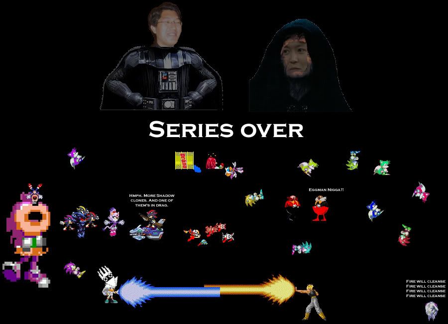
Silver sprite by
Gardow, Mephiles sprite by Dark the
Metalkirby, Blaze by
Anonymous. I was going to include a sprite furgy for good measure but decided against it.
Posted: Sat Mar 03, 2007 11:45 pm
by Kelso
Certain people tempted me away from real work for this.

Posted: Sat Mar 03, 2007 11:56 pm
by G.Silver
I'm still not finished with mine but I'm posting it anyway, so you'll know I tried to draw something that wasn't a cock. :(
Posted: Sat Mar 03, 2007 11:58 pm
by Segaholic2
We all know you love cocks.
3 minutes to thread lock.
Posted: Sat Mar 03, 2007 11:58 pm
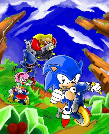
by cjmcray
Aw, lil Sonic's learning how to ride a tricycle!
Posted: Sun Mar 04, 2007 12:02 am
by Segaholic2
Voting threads going up tonight.
