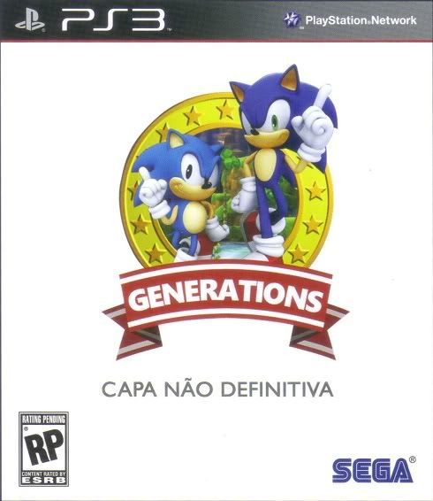
That box art really kind of hit home for me. Like, in a "this is actually happening" kind of way.
God, there was a time when this could have been a really good game.
Sonic Generations

Re: Sonic Generations
They're going to make classic Sonic out to be some small, childish musing in this game, I just know it.

Re: Sonic Generations
Childish garbage slapped together with reviews ranging from 5 - 7 out of 10 is probably not what they mean.cjmcray wrote:I find it funny how everyone is sick of the current "melodrama" of the Sonic franchise, and want a return back to a more silly and lighthearted tone/feel. Yet we get games that do exactly that (Heroes, Unleashed, Colors, the Storybook titles) and everyone still complains.
Re: Sonic Generations
Out of all those, I'd say Heroes did the lighthearted tone the worst. Colors probably did it the best, and I guess Unleashed and the two Storybooks are somewhere in the middle.

-
Crazy Penguin

- Drano Master
- Posts: 1903
- Joined: Sat May 22, 2004 10:06 pm
Re: Sonic Generations
Classic Sonic looks like crap on that preliminary box art. It's like they took inspiration from the worst of the American and European promotional art of the early 90s.

Re: Sonic Generations
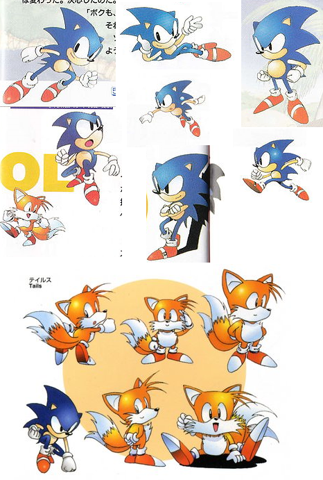
[url=http://I_am_too_lazy_to_link_to_the_European_Sonic_3D_boxart]I wouldn't say that.[/url] But indeed, classic Sonic doesn't look as good there as in the pre-Uekawa Japanese artwork. It's using a few shades of the American artwork (mainly the left pupil trying to get into the right eye and the ass crack eyebrow), which is probably intentional, considering how many people are used to it. But that's not what bugs me - it's the fact that he's a hell of a lot smaller than modern Sonic. It's like he's his sidekick or something, which is dumb. Oddly enough, tall Sonic actually seems the cutest one in that box art.
I have no problems with the modern Sonic design. Visually speaking, I think it has as many qualities as the classic one, though I can't say the same for every other character. Tails, in particular, looked a lot better in the nineties. That said, I really hate the 2D artwork for the modern designs. Uekawa's EXTREME POSES AND NIKE GRIN artwork may have gotten a bit better over the years, but the Sonic Adventure cover almost creeps the piss out of me.
I have no problems with the modern Sonic design. Visually speaking, I think it has as many qualities as the classic one, though I can't say the same for every other character. Tails, in particular, looked a lot better in the nineties. That said, I really hate the 2D artwork for the modern designs. Uekawa's EXTREME POSES AND NIKE GRIN artwork may have gotten a bit better over the years, but the Sonic Adventure cover almost creeps the piss out of me.

Re: Sonic Generations
You think THAT'S bad? Perspective time.
(actually a pretty decent magazine)
At the time I thought Uekawa's SA1 promo art was weird, but a really slick kind of weird. I like it and I especially respect it for the fact that it was a major shakeup from the norm. I wish they were still that ballsy. They've been doing essentially the same art style for years and virtually all the promo art anymore is CG so it's getting extremely stale.
Sonic Riders only sort of qualified as the last time they got experimental, as all the promo art that wasn't CG was Production I.G.'s work. So that leaves Sonic Battle...which was oh, 7 years ago now. Sheesh.

Re: Sonic Generations
I love the Sonic Adventure Uekawa cover drawing.Blount wrote:Uekawa's EXTREME POSES AND NIKE GRIN artwork may have gotten a bit better over the years, but the Sonic Adventure cover almost creeps the piss out of me.
For Generations, why couldn't classic Sonic be placed closer to the umm... viewer(?) so that they took up the same amount of space on the cover? They definitely don't look like equals and (ugh, I hate to be the guy to say this so soon) if this reflects the kind of quality they're putting into the game itself, things aren't looking good. (It's still probably going to be a day-1 purchase for me because Sega bought my soul at some point).
It'd also be a waste (or a bold divergence from the norm!) if they didn't bother to put the name Sonic in text on the cover. You can only get away with that stuff on collector's editions.

Re: Sonic Generations
Well I guess I have to break away from the crowd here and say that I think he looks perfectly fine on that cover. Yeah I prefer the Sonic that appeared in Japanese artwork rather than the US/European one, but it's still good and I still much prefer him to new Sonic.
Really, even though people are generally being conservative in their criticism here, I find it kind of depressing that, once again, when Sega tries to do something to please the fans, all anyone seems to want to do is nitpick it.
Again, this fanbase can't be pleased.
Really, even though people are generally being conservative in their criticism here, I find it kind of depressing that, once again, when Sega tries to do something to please the fans, all anyone seems to want to do is nitpick it.
Again, this fanbase can't be pleased.

Re: Sonic Generations
What actually bugs me about this is that "classic" Sonic is in his "classic" pose, but he's facing the right instead of left, and it looks totally off to me as a result. Modern Sonic being in the same pose also looks kind of ridiculous, we know he's capable of so much zaniness that to assume the same pose as classic Sonic seems strangely condescending.
Re: Sonic Generations
To be blunt, "Please the fans" is extraordinarily vauge and you can call most anything "nitpicking" if you feel sorry enough for the ones being criticized. I, for one, do not feel sorry for Sega one bit; they have brought it on themselves.Crowbar wrote:Really, even though people are generally being conservative in their criticism here, I find it kind of depressing that, once again, when Sega tries to do something to please the fans, all anyone seems to want to do is nitpick it.
Again, this fanbase can't be pleased.
Re: Sonic Generations
All SEGA have to do to win back the fans is make an unambiguously awesome game. Then I guarantee they will be flocking back to the franchise in droves.
Re: Sonic Generations
Just like that, huh.Crisis wrote:All SEGA have to do to win back the fans is make an unambiguously awesome game.
-
Crazy Penguin
- Drano Master
- Posts: 1903
- Joined: Sat May 22, 2004 10:06 pm
Re: Sonic Generations
Just goes to show that it's all in the execution. Whether it's Classic Sonic or Modern Sonic, Well Drawn Sonic always wins out. And the interior instruction manual art always looked even better than the box art anyway. Even the doodles that explained the stage gimmicks had a lot more charm than most renditions of Sonic.
Personally I think that Sonic looked great in all of the Sonic Adventure 1 and 2 promotional artwork. The later stuff seemed sterilised in comparison (Sonic Battle and Sonic Riders drawn art aside). People just bitch about the green eyed design because that version of Sonic has been in a lot of crappy games and very few good ones. The design itself is solid, and not hugely different from the original.

Re: Sonic Generations
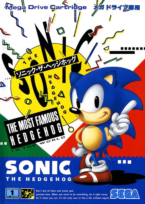
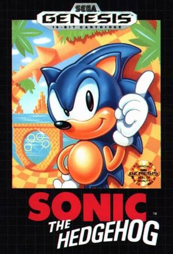
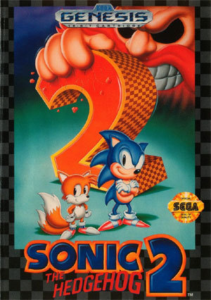
Man, there's some WEIRD stuff going on with that American Sonic 1 boxart that I never noticed before. What the heck is going on with his left arm? It's so long, his fingers would drag alone the ground!
Re: Sonic Generations
Well, yeah. They've done it before!FlashTHD wrote:Just like that, huh.Crisis wrote:All SEGA have to do to win back the fans is make an unambiguously awesome game.
Re: Sonic Generations
Oh, so someone figured out what was wrong. This is just made poorly.
And the American boxart is ugly. It should be based off of the Japanese design fully as was the European boxart (with the pretty picture of Robotnik floating around instead of garbage). By the look of the logo they used in the trailer, I assume they are bringing back coloured ribbons and shapes.
And the American boxart is ugly. It should be based off of the Japanese design fully as was the European boxart (with the pretty picture of Robotnik floating around instead of garbage). By the look of the logo they used in the trailer, I assume they are bringing back coloured ribbons and shapes.
Re: Sonic Generations

Is it just me, or does Sonic's head look copy-pasted in these covers?
Sonic 3 has a thing for fugly boxart, too. Check out squashed-face Knuckles.
Re: Sonic Generations
I really love the use of color on the American box. I like the way they styled the GHZ in the background, and I even like the depth of color they used on Sonic, even if he's drawn funny. There was a time when I would have been more hung up on Sonic's portrayal, but even with that in mind, it's still the one I like best.

If by "the fans" you mean the guys who can't make up their minds about which Sonic design they like better and take this as some sort of "serious business"*, or the Shadow's official fan club guys, that kinda people, then I'm not so sure about that.FlashTHD wrote:Just like that, huh.Crisis wrote:All SEGA have to do to win back the fans is make an unambiguously awesome game.
If you mean the general public who dig action games, then you're damn right, dude.
* For the record, I don't care about either of them, I'm totally ready for the next thing, nobody changes and evolves by looking back, especially the Blue Blur.
Re: Sonic Generations
My (poorly worded) point was basically that Sonic is an extremely marketable character with a huge, untapped fanbase (i.e. the general public who have either stopped buying or had never been introduced to the franchise). The series could be taken in virtually any direction, as long as the execution was flawless. And execution is just a matter of time and money.
Sonic Colours was a good start, taking the most popular parts of Unleashed and building a very functional game out of them. I wonder how such a product would have turned out with an additional 6, or 12, or 18 months of development time.
I would actually disagree a little bit that we should be looking to the "next thing". We've been doing that every year for about a decade and the best it could produce was Colours. Sonic Team are desperately in need of some time to take a step back and refine the ideas they already have.
LOL, when I said "the next thing", I was talking about Sonic's design, not game design.
Of course I agree with you there. Even if I personally dislike the Unleashed day/ Colors game mechanics, it's always better to at least release a functional action game, than be the laughing stock of the gaming industry.
Of course I agree with you there. Even if I personally dislike the Unleashed day/ Colors game mechanics, it's always better to at least release a functional action game, than be the laughing stock of the gaming industry.
Re:
Languishing in mediocrity with polarizing reception to every release isn't any better.Isuka wrote:Even if I personally dislike the Unleashed day/ Colors game mechanics, it's always better to at least release a functional action game, than be the laughing stock of the gaming industry.
Correction: the previous incarnation of Sega has. The current incarnation, after Sammy mangled it, struggles mightily at best. Also, even if the blind squirrel did happen to find a nut, there is no reason to trust that squirrel to do it again the next time: in '07, Sonic Team made Puyo Puyo 15th Anniversary, which was, rather out of nowhere, an awesome game even with a few questionable elements. Couple years later they made Puyo Puyo 7 and went straight back to sucking.Crisis wrote:Well, yeah. They've done it before!
tl;dr: current Sega is, based on the available pattern of behavior, a crapshoot.
Given the result of Sonic 4 Ep 1, I suspect that doesn't make much appreciable difference to anything with a substantially larger budget.Crisis wrote:I wonder how such a product would have turned out with an additional 6, or 12, or 18 months of development time.
-
Crazy Penguin
- Drano Master
- Posts: 1903
- Joined: Sat May 22, 2004 10:06 pm
Re: Sonic Generations
I'm particularly fond of the Japanese Sonic 2 promotional art, which was markedly different from the box art. The style used for the box art is the one that carried over to Sonic 3 and Sonic CD though, which is a little bit of a shame.