
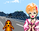
Here's a bit of a question: which art style of the Sonic characters do you prefer? Given that there's a radical art difference between 1997 back and 1998 plus.
I always see people mostly siding with the newer style, and I suppose I can see why, given that the newer style seems to feature more depth in the art and such. However, I can't help but side with the oldschool style, which comes off as less obnoxious and more... well, appealing to the eye.
Old Style vs New Style

The new one. Simply because Amy Rose looked like a godawful traffic accident between Sonic and a truck of pink paint in the old style. And who can forget that awful, clashing, bright green, Minnie Mouse dress? *shudders*
Amy's new design is actually decent and interesting.
Eggman looks better, too. Sonic's spines are also drawn in a way that makes sense.
I don't really see that much difference between Tails and Knuckles old styles and their newer ones.
Amy's new design is actually decent and interesting.
Eggman looks better, too. Sonic's spines are also drawn in a way that makes sense.
I don't really see that much difference between Tails and Knuckles old styles and their newer ones.

I approve of both.
Old School
Sonic- His design looked great, short blue fast hedgehog. His look gave away his personality. I liked the old-shool design because Sonic has that "I'm the best" look in his face.
Tails- In my opinion I liked how the old shool Tails looked. He had the shy look to him, but at the same time he looked brave.
Knuckles- I approve of his old design, he looked cool.
Amy- *Tch* It looks like they rushed out her design, I neer approved of how Amy used to look. I'm glad her design changed. She looks too "schoolgirl".
Robotnik- Robotnik looked okay. Not really the best bad guy design though.
Vector- His old design looks cool, he looks like a more overconfident version of Sonic (just as a crocodile). He looks cool, he has the walkman and headphones that make a nice tuch to his design.
Espio- He looks gangsta. He looks very anger and pissed off. I loved his old design when he used to look like a hot head instead of looking like a ninja.
Charmy- His design was cool back then.
New School
Sonic- He looks more loose, care-free, and less conceited (Sadly). He also looks more like a teenager than he did back then.
Tails- I hate his new design, he looks so gay. He used to be more orange back then, now he looks way too bright. But at least he looks more like a boy now.
Knuckles- His new design is a step up from his old one. He looks more wild and crazy, but at the same time he looks calm and good natured.
Amy- Her new design is so sexy. She looks beutiful.
Robotnik- His new design kick ass. His costume his great, but the shape of his body is still off.
Vector- I loved the fact that they made Vector a little more buff than he was before. He looks better, but his design does not fit his character. But I serously approve if his new look, I love the headphones too, but where's the walkman?
Espio- I like the design but I'm mad that they made him Ninja-like instead of making him a hot-head. I like his design though.
Charmy- One word GAY

-
Green Gibbon!
- BUTT CHEESE
- Posts: 4648
- Joined: Fri May 21, 2004 11:39 am
- Location: A far eastern land across the sea
- Contact:
Not quite on topic, but in the '90s, there was this one drawing done for American consumption in which Tails' left eye was obviously VERY out of proportion with his head. It was like they turned Tails into "Pink Eye McGee - With only One Eye To See".
God that pissed me off. And the annoying thing is, the idiotic Americans slapped that same, horrible picture, on any and all American merchandise featuring Tails. It made my head want to implode.
God that pissed me off. And the annoying thing is, the idiotic Americans slapped that same, horrible picture, on any and all American merchandise featuring Tails. It made my head want to implode.
-
Green Gibbon!
- BUTT CHEESE
- Posts: 4648
- Joined: Fri May 21, 2004 11:39 am
- Location: A far eastern land across the sea
- Contact:
There was this guy who drew several Genesis covers, including the Ecco games, and he always signed his name "Boris". I found <a href="http://vallejo.ural.net/">this website</a> that has alot of his work. His full name is Boris Vallejo, and apparently he's a well-known fantasy artist.
Motherfucker can draw some fine-ass women.
He also drew the cover for the Dreamcast Ecco game.
Motherfucker can draw some fine-ass women.
He also drew the cover for the Dreamcast Ecco game.

Holy shit! Is that true? I knew Boris Vallejo did the cover to Golden Axe (it's his usual style..) but I didn't know he'd done others.. Back in my BBS days, there was one that I dialed into that had a CD full of his fantasy images with tons of nekkid boobies in the public ftp area. I think the SysOp realized that kids were downloading that stuff at some point because it did go offline eventually, but it was nice while it lasted. What other games did he do? I'm not seeing any other covers I recognize in here (though several Battletech books), though plenty of familiar half-naked girls fleeing from giant snakes.
Don't much care for short-spiked Sonic, and I couldn't help but think of Eggman as looking just...silly.
Mad scientist with robot armies can look clownish if they want, but they ought to look a wee bit intimidating as well. Not that there wasn't something appealing about a spiny-legged Humpty-Dumpty sitting at the core of a giant robot with nifty lasers and whatnot.
Mad scientist with robot armies can look clownish if they want, but they ought to look a wee bit intimidating as well. Not that there wasn't something appealing about a spiny-legged Humpty-Dumpty sitting at the core of a giant robot with nifty lasers and whatnot.
-
Crazy Penguin

- Drano Master
- Posts: 1903
- Joined: Sat May 22, 2004 10:06 pm
Personally, I think there's only one time the anything pre-Sonic Adventure matches up with Sonic's look in SA and SA2, and that's the animated sequences in Sonic CD.
Ideally Sonic should have a very simple, streamlined and athletic look to him whilst maintaining a care-free, fun seeking, bordlerine smartass, adventurer personality.
Ideally Sonic should have a very simple, streamlined and athletic look to him whilst maintaining a care-free, fun seeking, bordlerine smartass, adventurer personality.

I'm going to agree with Penguin here: the Sonic CD animated sequences remain, to this day, the best incarnation of Sonic as a character ever, which is kind of sad considering they're not even games. He just had such fluency of movement. I might cry.
Bilby's avatar is still one of my favourite pieces of Sonic art, too.
Bilby's avatar is still one of my favourite pieces of Sonic art, too.

Agreed, the Sonic CD opening is my favourite piece of sonic animation ever made, and remains a pinnacle of which Naka and the Team just have never surpassed. Does anybody remember that little animated promo where Eggman dressed up as Sonic (complete with rocket powered rollerskates) and went around fucking stuff up to blame it on him though? I *think* it was from Sonic Jam, but my memory's a little foggy on that. It was quite cartoony, but it was still pretty neat.
Speaking of which, I think I remember it being cut at the end with a 'to be continued', although I've never seen Sonic Team animation or any animation for that matter in the same vein. Anybody else seen a continuation? Or even know what I'm talking about?
Speaking of which, I think I remember it being cut at the end with a 'to be continued', although I've never seen Sonic Team animation or any animation for that matter in the same vein. Anybody else seen a continuation? Or even know what I'm talking about?
-
Crazy Penguin
- Drano Master
- Posts: 1903
- Joined: Sat May 22, 2004 10:06 pm
-
Green Gibbon!
- BUTT CHEESE
- Posts: 4648
- Joined: Fri May 21, 2004 11:39 am
- Location: A far eastern land across the sea
- Contact:
The animation in the Sonic CD opening is nice, and is particularly notable for the way it portrays Sonic in motion. However, I hate the character model in it. His spines aren't long or pronounced enough, and his mouth and eyes just reek of low-budget anime. I'm a geek, I like anime, but Sonic shouldn't look like an "anime" character.


-
daytonafathead

- Douche Bag

- Posts: 105
- Joined: Thu May 27, 2004 10:38 am
- Location: a giant hole
- Contact:
-
Tsuyoshi-kun

- Posts: 946
- Joined: Tue Sep 07, 2004 11:33 am
- Location: Philadelphia, PA, U.S.A.
-
Timestones

- Posts: 203
- Joined: Thu Jun 17, 2004 11:11 pm
- Contact:
I have to say I prefer the new style, particularly the art for Sonic Adventure and Sonic Adventure 2. It just infuses a lot of personality and energy into the characters in a way that really brings them to life. I like the way Sonic was drawn in particularly, as he always looked ready to spring into action at a moments notice, yet he also had this look of being loose and, well, I can't really think of a word to describe what I mean, but he looked like he could really just do whatever he wanted, whenever he wanted to. The design was very slick, IMO. And of course, there are other characters who were vastly improved *coughAmycough* and some that didn't really change much, but looked good in the new style anyway.
And I think the closer we got to the time before the Sonic crew got a makover, Sonic was getting a bit too. . . cuddly, I think is the appropriate word. He was losing his edge, design wise.
And I think the closer we got to the time before the Sonic crew got a makover, Sonic was getting a bit too. . . cuddly, I think is the appropriate word. He was losing his edge, design wise.
-
Brazillian Cara

- Posts: 1729
- Joined: Sat Aug 07, 2004 5:30 pm
- Location: On a never-ending quest to change my avatar.
There was a guy I knew back when I first got online going by the name Enryu Kiken (you can still find traces of him online if you like obscure Japanese shooters and, err, sexy pandas) who had a little Sonic page up. Anyway, he had this picture he'd done of Sonic looking a bit like a DBZ character--this was when DBZ was still just finding its footing on saturday morning cartoons in the US and it wasn't so trendy to hate it yet--sort of muscled, almost, and with spines that were longer and more flowing. Maybe this picture is still around somewhere. I asked him about it and he said "this is how I really imagine Sonic."
So when the Adventure art style came around that image was what immediately came to mind. They aren't really all that similar (his wasn't nearly so stylish), but I was pretty surprised at the time.
So when the Adventure art style came around that image was what immediately came to mind. They aren't really all that similar (his wasn't nearly so stylish), but I was pretty surprised at the time.
I prefer the old Sonic. His spines kind of made more sense to me, because they were actually along his back, like a hedgehog's, except a hell of a lot bigger. I remember that really shitty picture of Sonic, the one where his other pupil was almost impossible to see. It was in a different style from Bilby's avatar (which I like better).
The old Amy and Eggman sucked, though. Their new designs are great, and Eggman's new suit thing is pretty cool. It's weird they would put her spines down, though, but it still looks good.
The old Amy and Eggman sucked, though. Their new designs are great, and Eggman's new suit thing is pretty cool. It's weird they would put her spines down, though, but it still looks good.